Some steps Henrique Heraclio have been taking at the Animation Workshop University, Denmark
Mostrando postagens com marcador Illustrations. Mostrar todas as postagens
Mostrando postagens com marcador Illustrations. Mostrar todas as postagens
It's been a long long time since I last posted something here. I was busy with my internship at Illumination Mac Guff in Paris. The school blog, as my course comes to an end start to lose its reason. I'll may keep it, with a different name perhaps, for there's so much material here.
Another stage of my life is coming and I'm looking forward to see what's gonna happen. Posts will tell what's gonna happen.
This drawing was made at Orsay Museum in Paris in one of my several tours there. The museum has an amazing corridor with sculptures, which on the sides two huge benches go along until the end of the hall. That allow people to sit and contemplate the sculptures for as long as they want. It's an amazing invitation for artist.
Stay tuned, more to come
My period at The Animation Workshop is coming to an end. Now that I'm having a liitle bit of free time (sorry for not posting all the stuff that have made me very busy during the past couple of months) I've been through a hard selection of drawings. I have so many and, together, they are so heavy. I have selected some nice ones that I want to keep, some I digitalized and others I just had to get rid of...
Moreover after achieving this I could go to the fantastic worlds of Shapes, Values, Colors...(sigh) I'm so screwed...
I've decided to take my winter vacation to develop color skills. Compared to CG students we, animators, barely had color class. So this is time to make something that is not moving and so important to any designer. I started very basic, learning how the light influence colors and mood on basically one object.
It's a looong way...
Clementine in living room with candles during dusk
Clementine in living room during cloudy winter afternoon
Cat in kitchen during cloudy winter afternoon
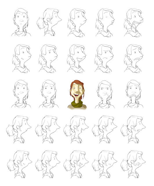
Continuing my short animation I experienced a hard stage...What colors the character should have. Choosing the colors of a character is very definitive because it gonna last for the entire production. If I regret about the color when I already colored most of the scenes I would have to go all the way again recoloring - and that would be a pain in the ass and a lot of time wasted.
So! This is the palette chosen for the character. I think it has balanced tones between warm and cold and complementary colors (green and red). It will give a nice contrast to the background once it is autumn and everything is yellowish and cold, and a bit "dead". Having green for the character gives him a bit of "power to life"
Hope you have enjoyed my choice because it was very difficult to choose, even hearing with many suggestions.
I made previously some samples varying the palette to see which could fit better for the short:
Character Design Class
We had an amazing Character Design class for the last 2 weeks. I am posting here some of the developement stages we went through:
Rough, Concept, Maquette
...maquette
I tried to get rid of my stabilished style and go for something personally unusual. I am rather satisfied with the character. In may I am going to animated it
Cheers
The last assignment of the week - a full render composition regarding the concept of space.I spent too much time rendering these guys and didn't really have time to make the intended composition...So I show here only the worthy part of the job.
However I learned a good lesson on this work.
"All the talent, high skills or whatever becomes worthless if you don't know how to use the tools you have"
This is a good example - all this perfectionism with managing the pencil becames meaninless if I can't tell a story with it. It becomes just a bunch of good render puffy bumps.
Good lesson to pay more attention on HOW to use properly this technical tools.
We went through a quite poetic assignment on tuesday. Make a gun out of plants. The idea was to make a full render image - an extension of the value assignment reaching all ranges of value in order to get a desired volume. I went a bit forward and made my render based also on texture. Each element should have its own texture to give a better feeling of realism.
Crazy day though - until 2am rendering this insane drawing
Sketches
I finally got the chance to go to croqui class - I have 2 main reason to not go. One: I always forget. Two: I always remember at the wrong time.
But anyway. After reading the "book" written by Walt Stanchfield, basically about his noted and reflections about drawing for animation, I got inspired to try his approach to drawing a life model. The main thing that he keep mentioning all the time is: Don't trace the model. Go further with the pose.
So that are my attempts...
Hope you like
Assinar:
Postagens (Atom)


